Christmas, 1955. As cinema staff gingerly unwrapped the reels for a new Frank Sinatra movie their attention was drawn a little note stuck to the cans: “Projectionists – pull curtain before titles”. Before The Man With The Golden Arm hit screens, credits sequences has become so dull – essentially rolling boilerplates 'enlivened' by the odd drifting cloud – that they'd become used to waiting until they'd finished before pulling back the curtain. Saul Bass’s simple but stylised title sequence for Preminger’s melodrama – not to mention that handy note –changed all that for good. “Everybody said ‘Wow!’” Se7en title designer Kyle Cooper explains of this quiet revolution, "main titles can be more then just this utilitarian thing that we have to get out of the way”.
Put simply, Bass was a gamechanger. He applied commercial design techniques to create timeless motifs for the movies of Preminger, Hitchcock, Wilder and Scorsese. Think of Vertigo’s Lissajous swirls or Carmen Jones’s scarlett rose, the first of 12 collaborations with Preminger. Think De Niro’s fiery descent to hell at the beginning of Casino. Think the credits sliding across North By Northwest’s citiscape like an elevator. And if you like porridge, he designed Quaker Oats’ logo too. The man had game. To celebrate the release of Saul Bass: A Life In Film & Design, a feast of Bass rarities and insights lovingly compiled by his daughter Jennifer and design historian Pat Kirkham, we’ve laid our hands on some little-seen posters and storyboards.
According to Martin Scorsese, Saul Bass’s greatest gift was for creating “an emblematic image, instantly recognisable and immediately tied to the film”. This trade ad Bass created for The Man With The Golden Arm (1955) played on the power of that simple, emblematic image – the grotesquery of a junkie’s distorted arm – while tying into a ‘package’ of ads, posters and, of course, that iconic credit sequence{
A rare electric pink colour scheme for a Vertigo (1958) advertisement. Bass, who worked with animator John Whitney to translate the Lissajous spirals into the movie’s title sequence, aimed to capture “that very particular state of disequilibirum associated with vertigo”. Alfred Hitchcock worked with Bass twice more – on North By Northwest and Psycho{
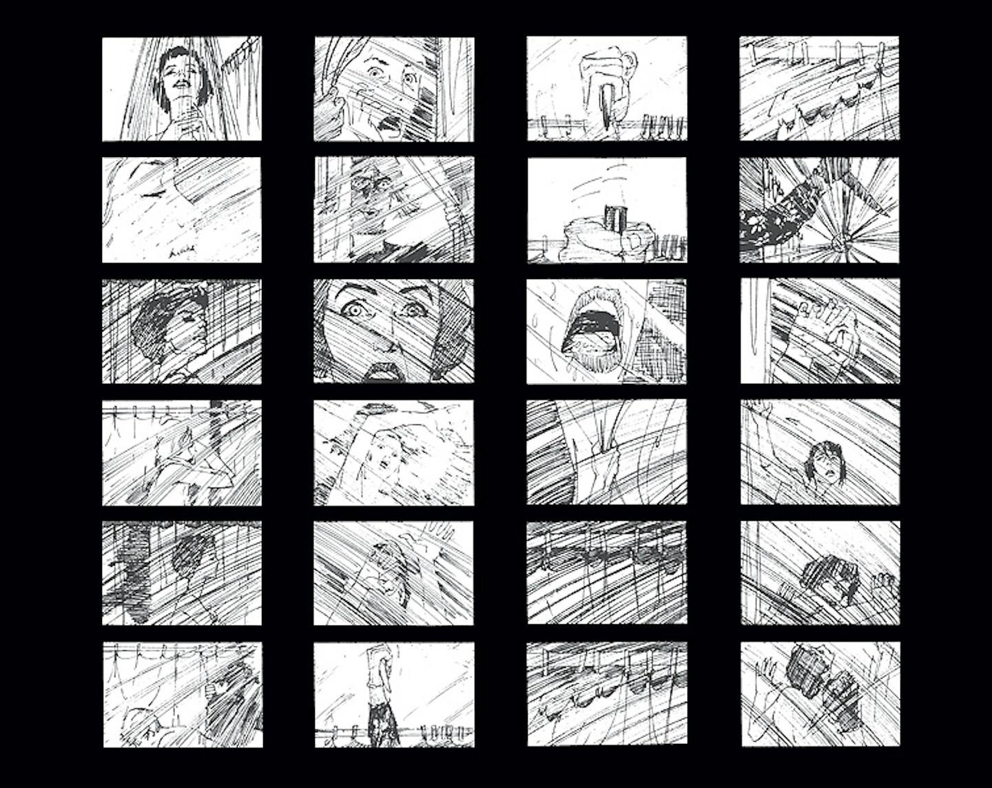
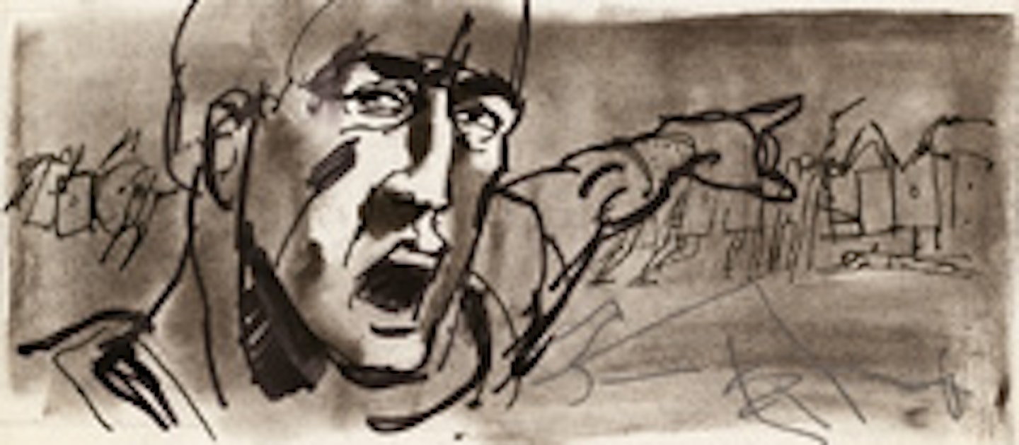
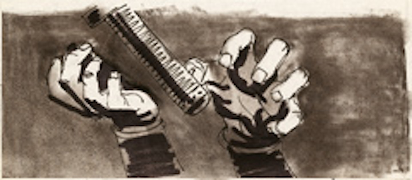
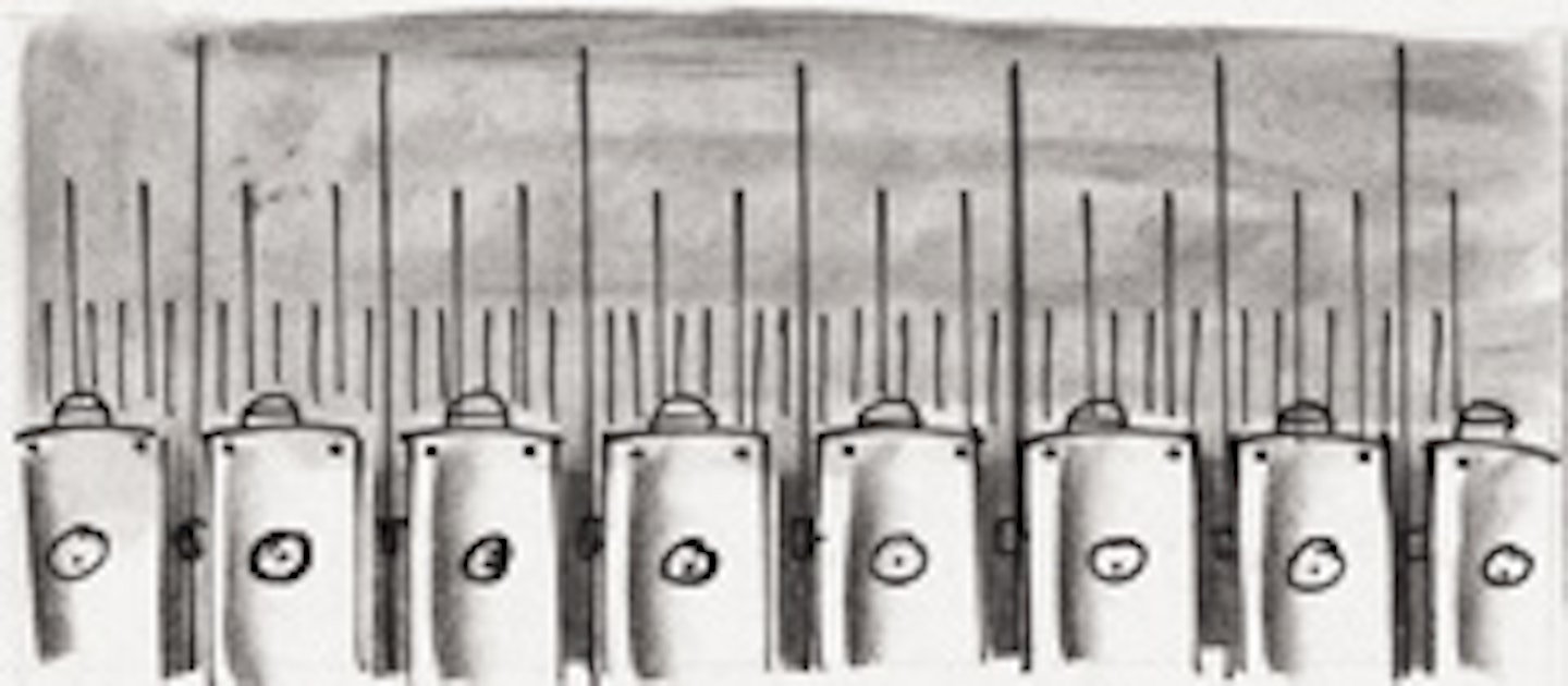
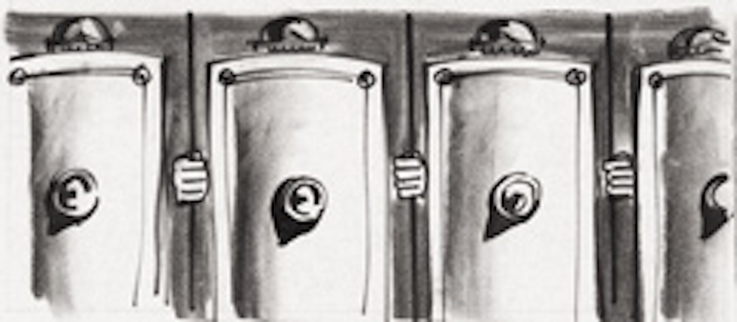
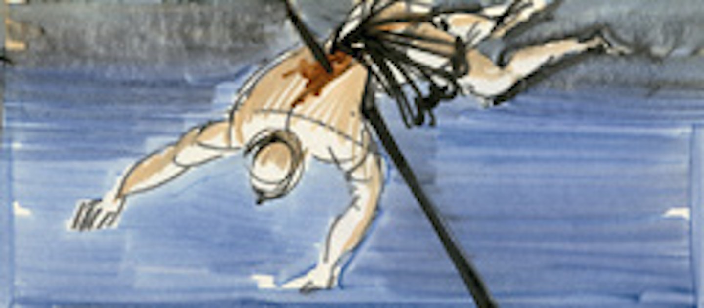
Hitchcock was famously ungenerous about Bass’s contribution to Psycho (1960). During his interviews with François Truffaut he played down the designer’s contribution to the shower scene and mocked Bass’s second-unit direction of the detective’s walk up the stairs. “When I saw this put together it looked terrible wrong” ,grumbled Hitchcock, “(because) it belonged not to an innocent person, but to a sinister person”. But the quick-fire editing of these storyboards speaks volumes of Bass’s input, right down to the swirl of blood down the plughole. “Right from the beginning I understood that Saul did it”, commented Billy Wilder. “Who questioned it until those remarks of Hitchcock? You only have to look at the sequence and look at the film and think. Think for one minute. You see the shower scene and you see it is not at all like Mr. Hitchcock - King of the Long Shot.”
This trade ad for The Magnificent Seven (1960) was so wildly different from the traditional iconography of the Western that the studio never used it. Criminal, if you ask us. The nod to Japanese calligraphy is a nice reminder of the movie’s roots – Kurosawa’s Seven Samurai – although the absence of star names on the print might have raised a bushy eyebrow or two among studio execs fresh from signing some sizeable pay cheques.
This classy trade ad for Kirk Douglas starrer Champion (1949) was Bass’s entrée to producer Stanley Kramer weighty ‘social conscience’ films. His trademarks are present and correct: from the Bauhaus-influenced minimalism to the punchy, noir look he created for the hard-edged boxing drama. The eagle eyed will notice that it’s also got screen idol Kirk Douglas pulling a ‘Twilight’, so he wasn’t blind to the interests of teenage girls either.
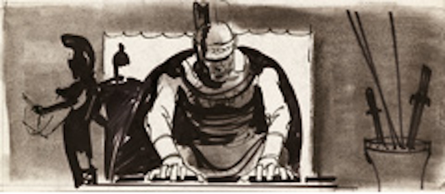
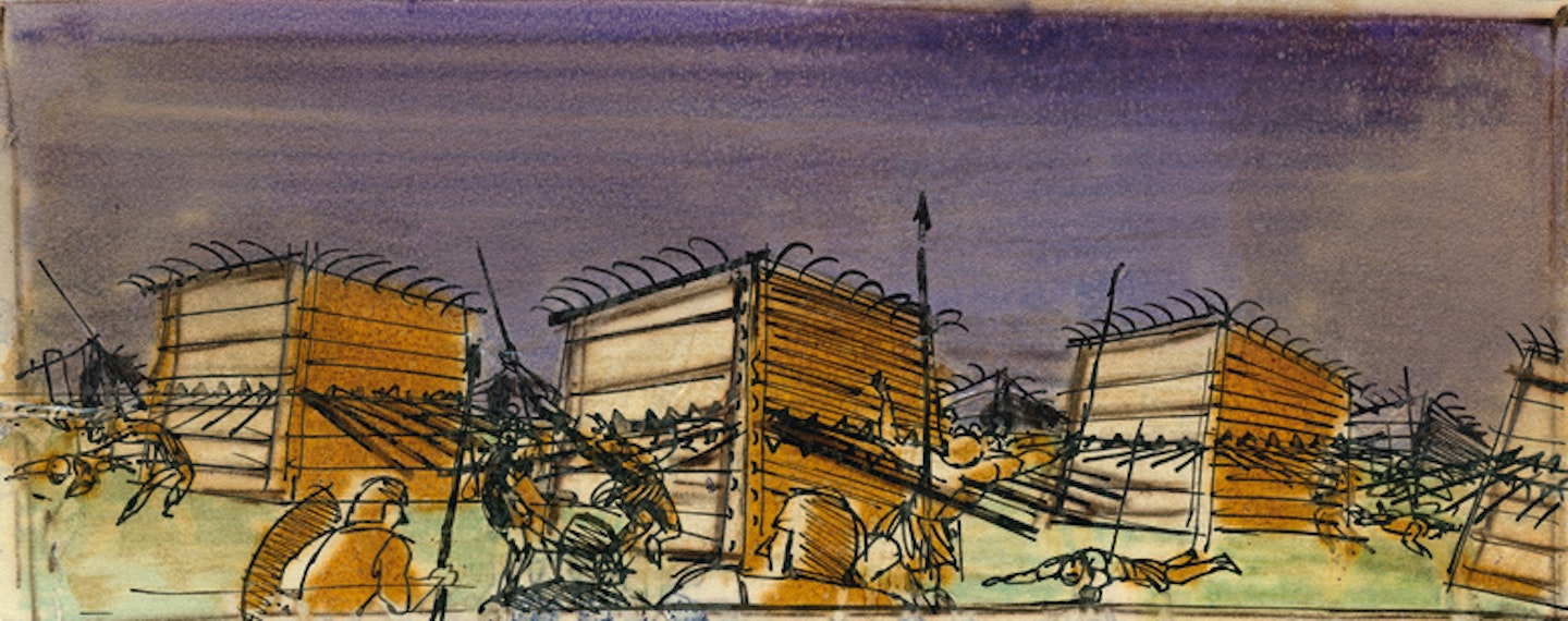
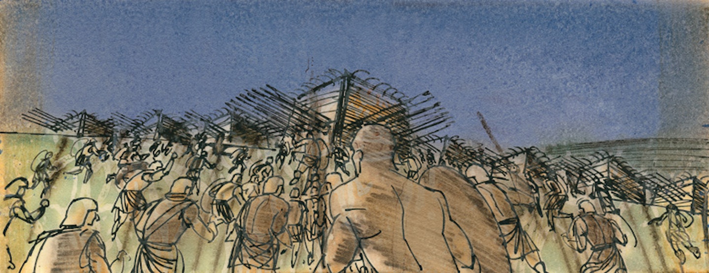
Eleven years after Champion, Douglas hired Bass for Spartacus (1960), the slave epic then due to be directed by Anthony Mann. Of course, that’s not how it worked out, but in a fraught production beset by movieland’s equivalent of a series of flaming logs, Bass tied together the film’s identity with his classically-informed design{
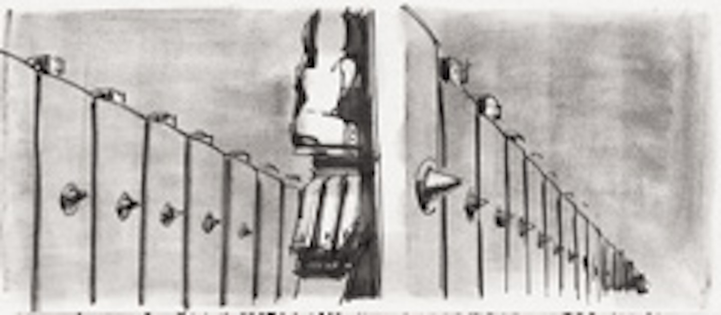
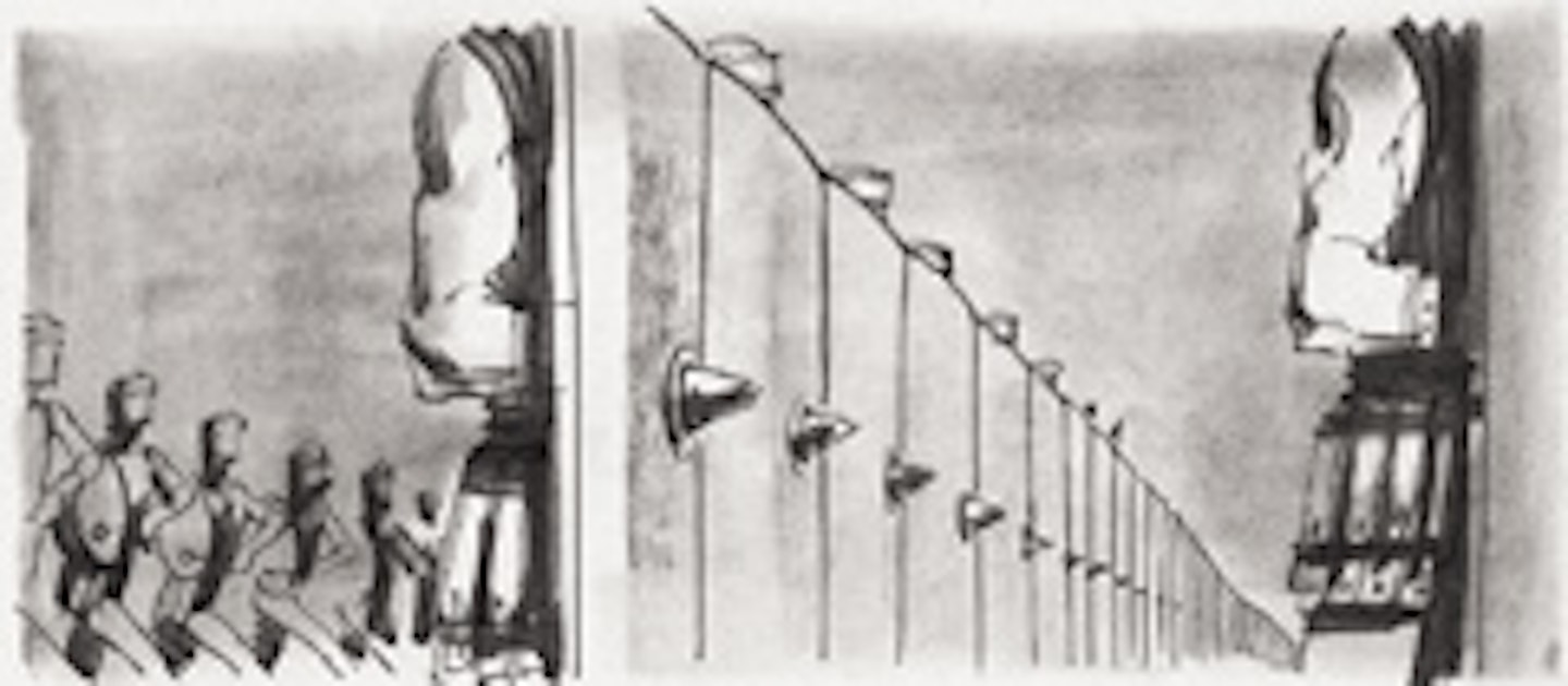
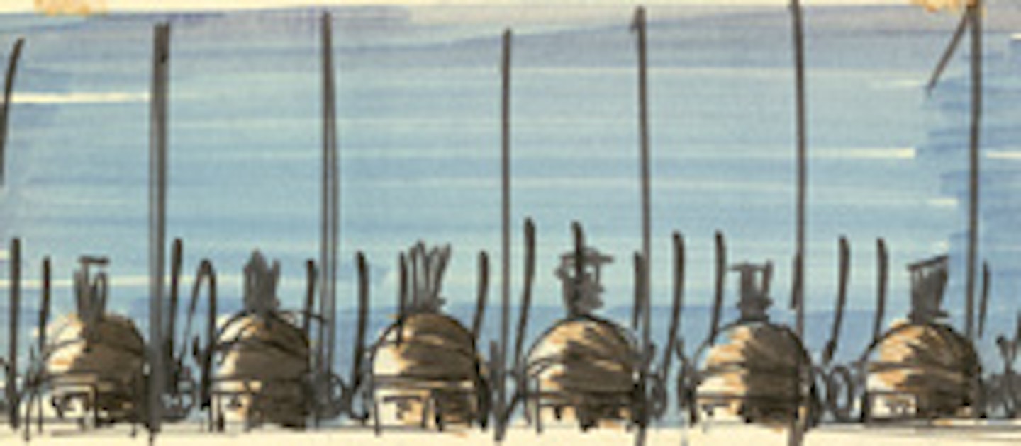
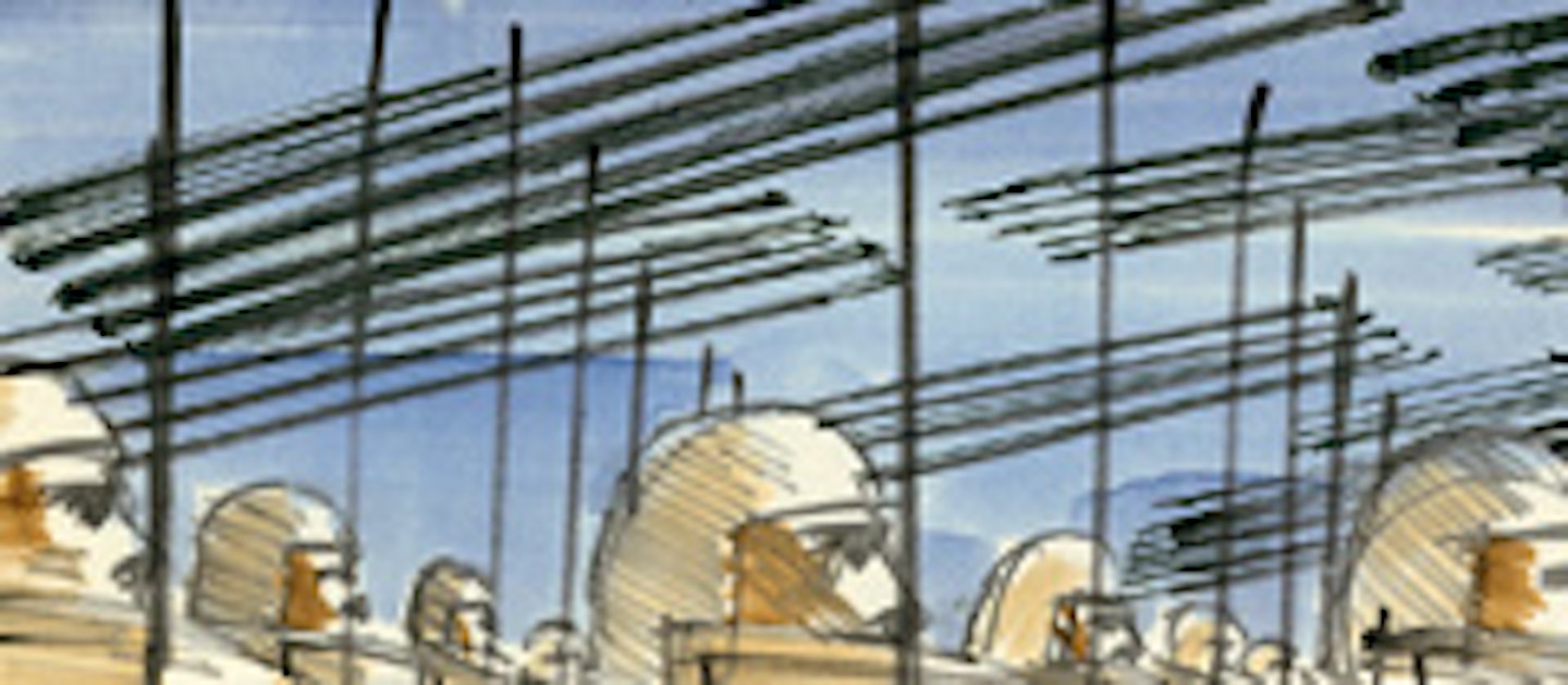
The calibre of Bass’s collaborators spoke loudly for his talents. Although it wasn’t Stanley Kubrick who recruited him to piece together Spartacus’s opening sequences, their pairing was successful enough for a reunion 20 years later on The Shining. Kubrick had been an admirer of his fellow New Yorker from his early work with Otto Preminger. Not all of Bass's vision for Spartacus made it to the screen, though. His storyboards for the movie’s grandstand battle show an elliptical sequence with the camera lingering on fragments of the fighting – a row of shields here, a skewered legionary there – but in those long-distant days when budgets went up as well as down, it was scrapped in favour of just recreating the whole thing lock, stock and flaming barrel.


Bass’s Hollywood-friendly trade ad congratulated old mucker Otto Preminger on wrapping Exodus (1960), his stodgy Israel origin story (see, it’s been wrapped! In paper!). The designer joked that the film canister looked like a loaf of pumpernickel bread. Critics wished it had been.
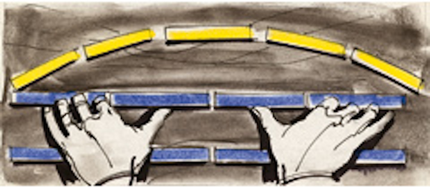
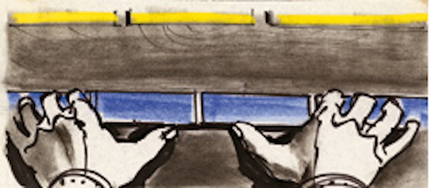
Recovering from a hip operation at the time, Bass initially turned down John Frankenheimer’s request to create the title sequence for Grand Prix (1966). In the end he went one better, signing on as visual consultant for the film. Bass designed the majority of the races, supervised the final cut and put together this typically snappy one-sheet. Talent, vision and a good physio too.
Saul Bass: A Life in Film & Design, Pat Kirkham and Jennifer Bass. Laurence King Publishing