Voted by Empire's writers as their best film of 2011, Drive is one of those achingly cool movies that's destined to become a cult classic. The kind of movie, in fact, that film buffs will hang posters of in their bedrooms for decades to come. So when we got the chance to speak to Rich Andrews of Empire Design - no relation - to talk us through his work on creating Drive's poster campaign, we jumped at the chance. Guiding us through the alternate versions of the final design, Rich explains the ins and outs of making Baby Goose look extra,* extra* cool...
"We wanted to try a really modern, cleaner look here. Obviously, the quote stood out for us, and we do sometimes put quotes on posters, but they’re not often as good as this one. I think we ended up using the quote on a press ad, as it happens."
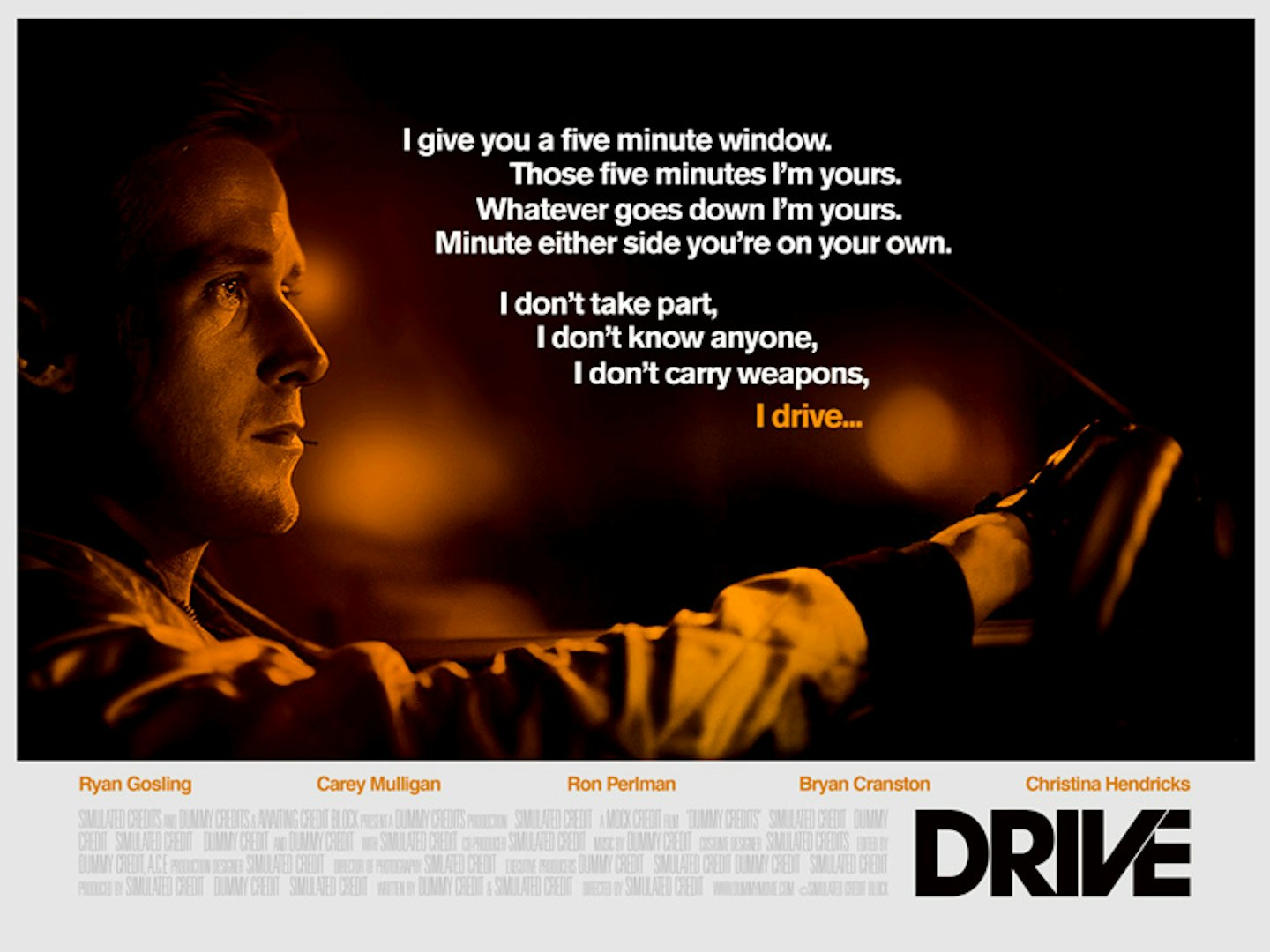
"In many ways, the Driver is such a simple character – and that quote just sums up his role in the film, reflecting on how he’s such a straightforward character with such a straightforward quote."
"Ryan almost looks like something out of Duran Duran here. Possibly the most ‘80s of our posters – even though, of course, it’s not set in that era. For me, it’s got a Francis Ford Coppola vibe, a Brian De Palma thing going on with the music and some of the clothes. As for the quote at the top, what happens is we’re normally given a selection of stuff and we pull out what we think works from a market point of view, and that one just seemed like a great quote to run with. So powerful – and something we 100% agreed with."
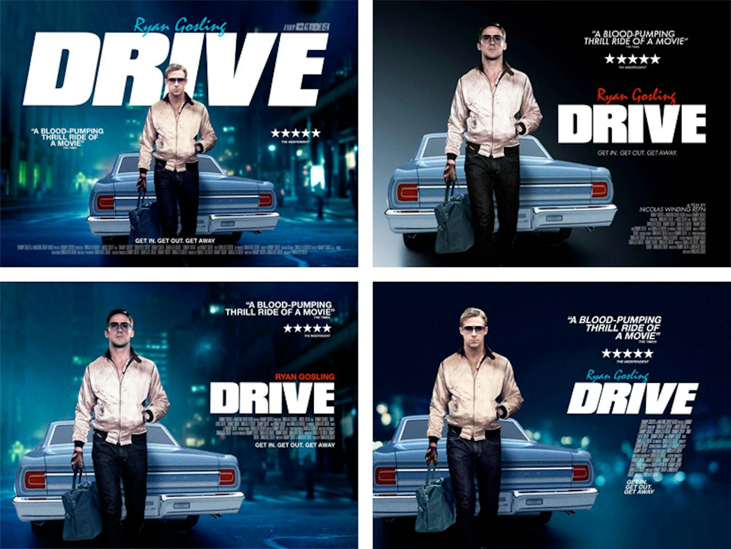
"This one’s very, very retro. Probably a bit too retro, if I’m honest. Doing a collage like this is pretty damn hard – unless you’ve got Drew Struzan or some other amazing artist on hand. This was just us exploring some other routes – obviously the other characters are pretty interesting, with the whole gangster side and so on. This was an attempt to tell more of a wider story. And though we never really felt it was going to be the right angle to take, sometimes you do these things just to try them and confirm they aren’t working."
"By this point we’d realised the strength of the film’s title, and made a few tweaks: Ron Perlman instead of Oscar Isaac, more airbrushing. We were going for a more cultish, b-movie-ish feel, basically. Very similar to the last one in terms of direction and elements, but now it’s got a proper tagline now too – we always come up with a few, and I guess this was a way of telling a bit more of the story."
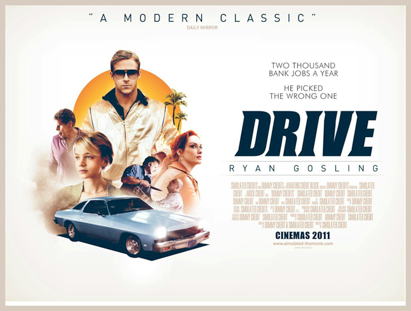
"Then again, doing that can make the movie lose a bit of its mystique. With Albert Brooks threatening someone, you know straight away there are gangsters involved. On the previous ones, it doesn’t really allude to that – it could literally be a movie about driving."
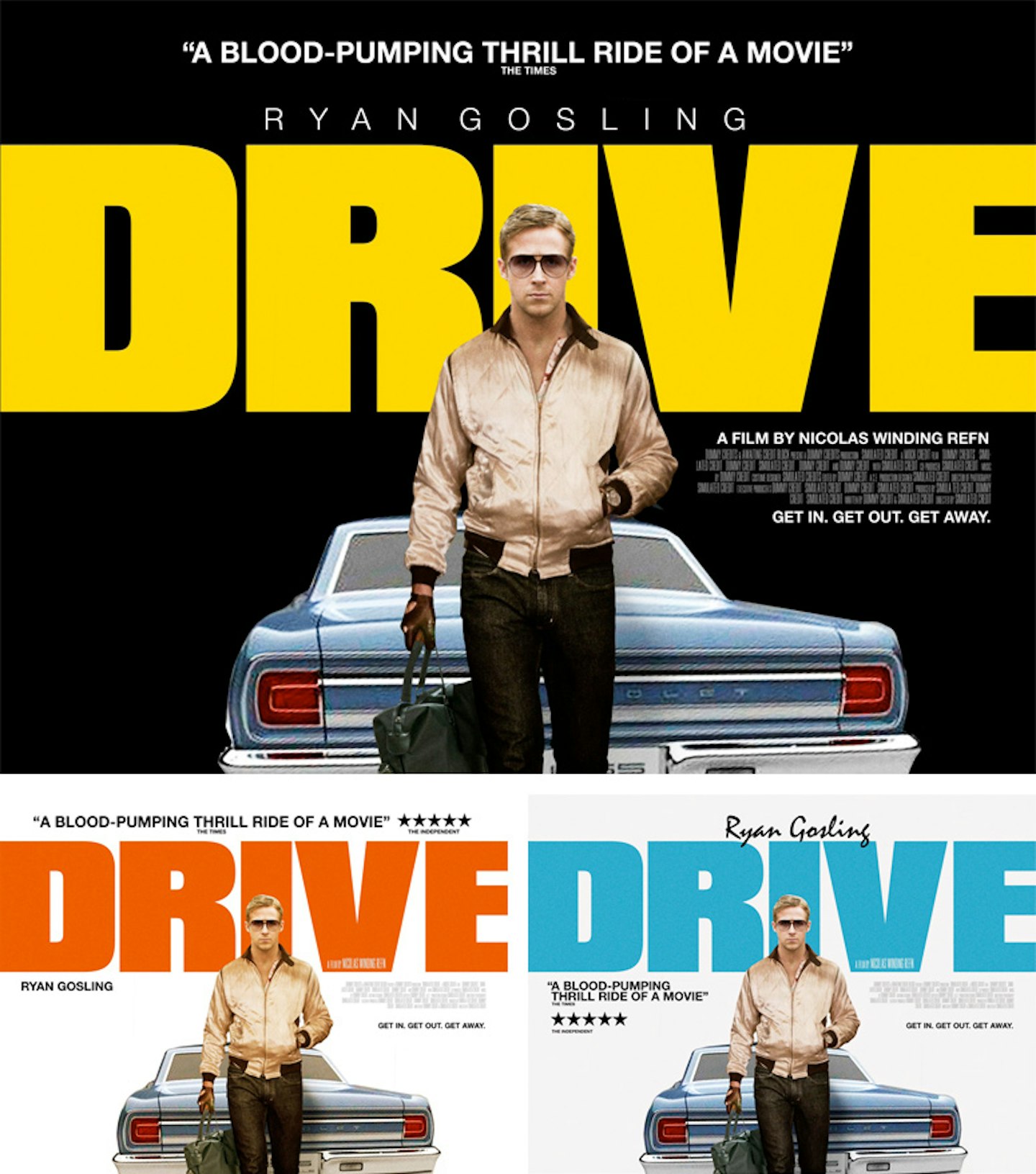
"Ryan walking away from the back of a Chevrolet here, with a much, much bigger font, and a different colour palette. Here we were just seeing how much we could strip it back, how bold we could be – just him, the car and the title. Even now we knew we were getting there. I liked the yellow and back, I liked its punchiness."
"Even the simplicity of him with the gloves, the bag, the jacket – that tells a bit of the story, but not too much. Showing off the back of the jacket was hard, even though we did have some shots of Ryan wearing the jacket, looking over his shoulder, but it didn’t quite work out."
"The script typeface there is called Mistral. It’s quite funny, because it’s derided by many design communities – it’s almost like putting Comic Sans on there. But it’s one of those things, because having already watched the film, with the titles set in that typeface as well, I always wanted to have at least something written in it."
"That street background is a generic background shot, something we have on our files. I was very influenced by this amazing Taxi Driver poster by a Belgian artist called Guy Peellaert, which is this incredible painting of De Niro in front of his taxi. The whole feel, the whole mood of that was what I was trying to achieve. It doesn’t scream New York, there’s not much in the background, just this slight seediness to it. We’ve got that poster up in our office, actually."
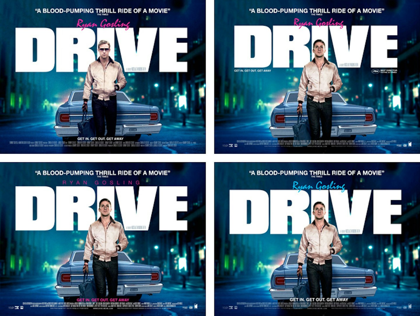
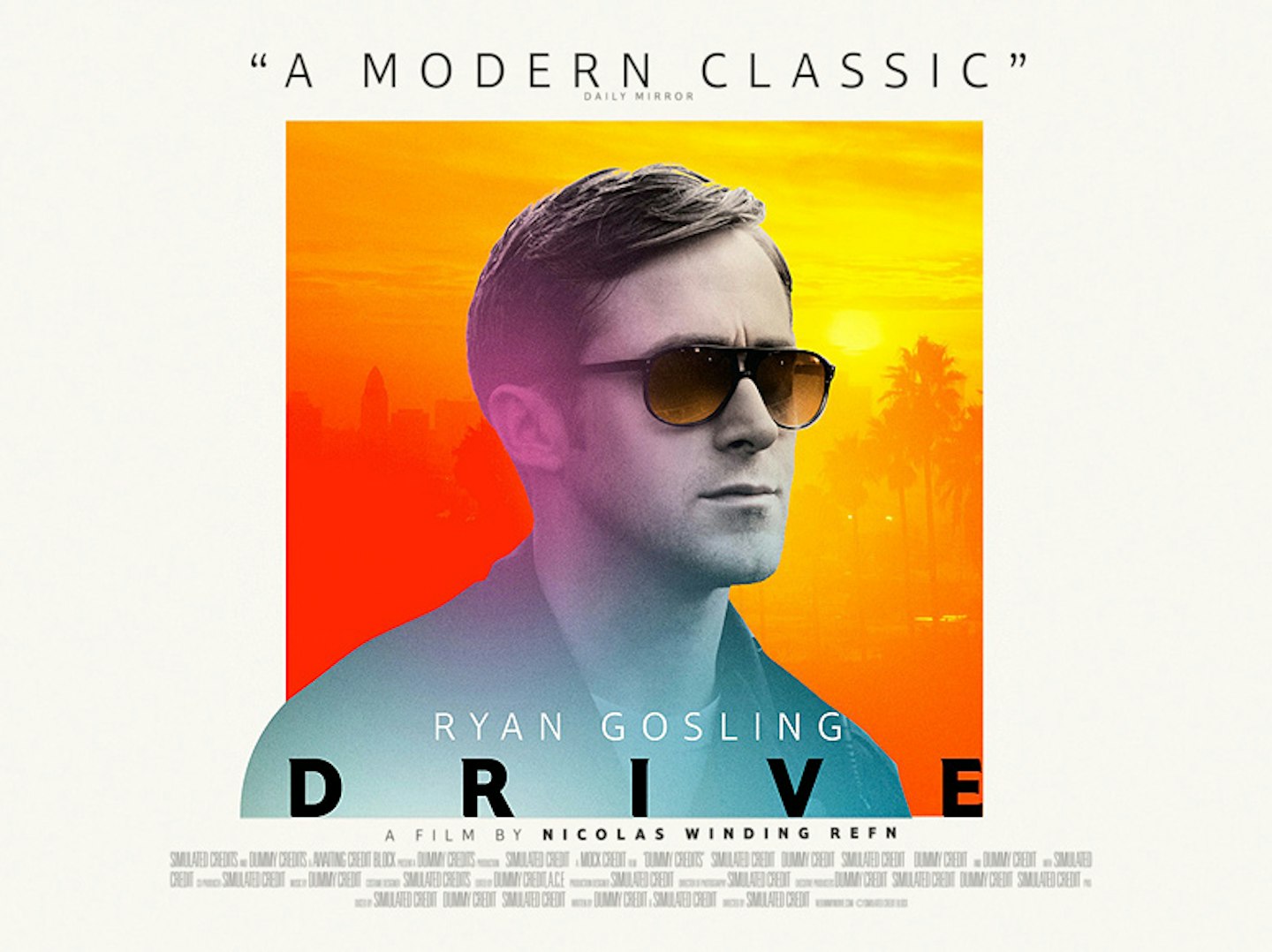
"The original shot of Ryan’s head is him looking up, no shades – Icon just wanted to explore something a bit more direct with the others. But I really like that he’s looking up off camera, it’s less posey. Feels more of a moment."
"We’re always trying to make it not look like a photoshop job, but when you’ve got to put the shades on, you’ve got to put the shades on. We actually got to a certain round of approval before Nicolas Winding Refn said, “No shades.” We heard he was really pleased with the final result, which was nice because sometimes directors aren’t really involved with it."
"And here’s the finished product. That’s not actually his car, by the way. I feel like I’m ruining some of the magic here, but it’s true – it’s not quite the right car, but it’s definitely the right model. I think it’s a year out, actually – the real one has rounded headlights, but this one has square ones."
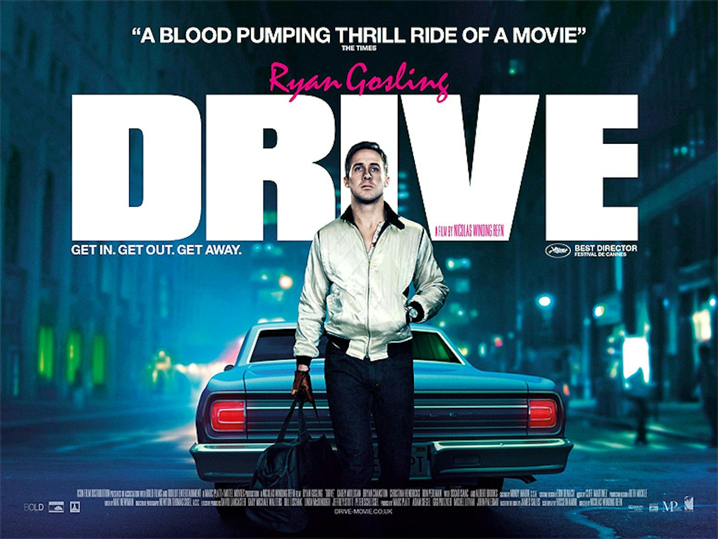
"The other interesting thing is that we had to drop in the hand ourselves, as well as the bag. In the original shot he’s carrying a hammer, you see. It’s from the scene where he’s walking through a strip club to drive a nail through someone’s head, actually. The bag was just something we bought from Sports Direct. It’s my hand, actually – that’s my claim to fame."
Drive is out on DVD and Blu-ray from January 30.