With the arrival of these three new The Adjustment Bureau posters, featuring Matt Damon, John Slattery, and, um, Matt Damon and Emily Blunt together (why doesn't Emily get her own, huh?) we decided that enough was enough. What is it with movie poster designers just taking a picture of a character and slapping words over their faces? Is that all it takes now? Sure, sometimes it works (and works well), but really we see the potential for abuse -- we don't want another back-to-back-Romantic-Comedy-lean to happen, now do we? To prove our point, here are a just a few examples of a trend that doesn't seem to be going away -- as well as a few mock-ups of what other movie posters might have looked like with the Words Over Faces look...
Update: Two years ago, there was a spate of Words Over Faces posters on our country’s street furniture, no better highlighted by The Adjustment Bureau’s triple whammy of BIG LETTERS over BIG FACES. Now, with the arrival of Neill Blomkamp’s Elysium and the final season of Breaking Bad (and more), it appears the poster design trope is back with a vengeance, and here below is our celebration – of a sort – of how good people look when they’re hiding behind sans-serif fonts.
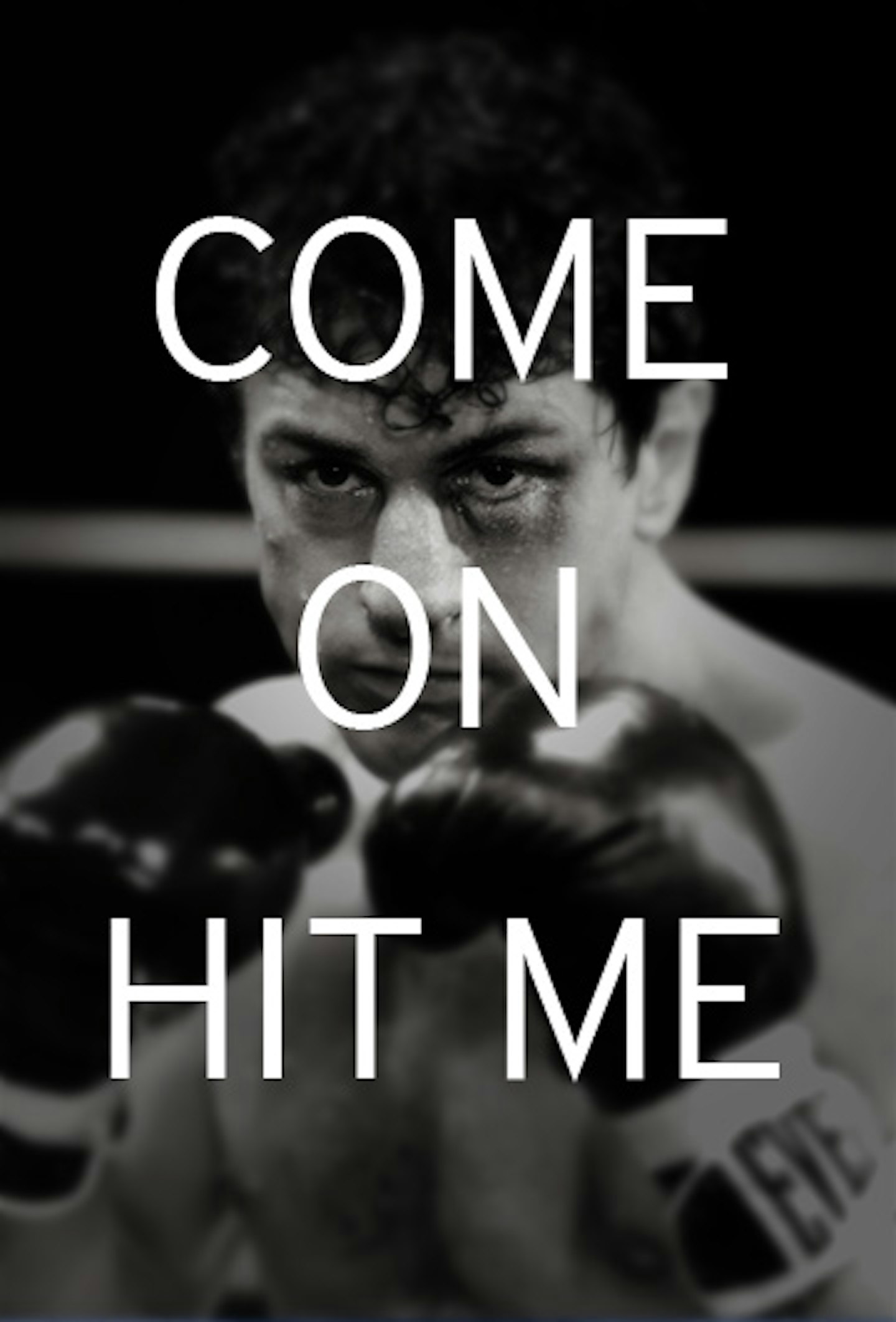
If your movie had a title as inspiring as The Adjustment Bureau, would you go for a greyscale picture of your lead with the words “YOUR FATE HAS BEEN ADJUSTED” over it? We’re not having a go here – you can only properly judge a movie after seeing it, and as it happens this one is pretty aces – but this is your poster? Come on now…
A greyscale picture of your antagonist, and you can’t even see his face… because of a hat? We know that hats are important to the story, but we’re guessing you’re using posters to try to attract people into the cinema – so maybe this isn’t quite the thing to do. Plus, changing ‘FATE’ to ‘WORLD’ isn’t really cutting it, to be honest.
This could be the most frustrating poster in the greyscale The-Adjustment-Bureau-Words-Over-Faces triptych, simply because one of the most beautiful and wonderful and amazing women ever (That’ll be Emily Blunt, then) is being covered up by Matt Damon. More specifically, Emily’s right eye is being covered by Matt’s left ear – Matt’s ears have never looked so big, in fact. Also, where she’s standing, it looks like part of Emily Blunt’s body should be part of Matt’s too. It’s all very weird, to be honest.
Also, remember the phrase “YOUR FUTURE HAS BEEN ADJUSTED” because…
…has an incredibly similar capitalised Words-Over-Faces poster. Fortunately, the greyscale picture has gone. Unfortunately, it’s been replaced with a blurry picture of George Clooney. Why blurry? George is a damn good-looking man, he’s better than blurry, and you know it. Perhaps the poster designer was just sick of looking at all that handsome.
It’s hard not to like this one – even though the address bar on the right does force you to tilt your head to the side like an inquisitive puppy. This is the one that’s most responsible for the current trend: everyone went nuts over it, and suddenly we’re flooded with the things.
The film itself may not have done as well as hoped, but the poster is undeniably beautiful. Brought to us by designers Kellerhouse, everything is just right, from the font (Didot, we’re told) to the noticeable lack of Photoshop. It’s refreshing, intriguing and one of the best Words-Over-Faces posters out there.
Let’s be honest, some of The King’s Speech’s other posters didn’t do the film justice. Examples can be seen here and here. But this one really nails it, with Colin Firth’s face immediately catching the eye, and the font perfectly mimicking the red “Keep calm and Carry On” poster that’s made its ubiquitous way onto mugs, shirts and underwear recently. Whether this one makes its way onto a pair of pants remains to be seen. Our guess? Not so much.
We're guessing they were using the words-over-faces technique to emphasise Oasis's second album title (and the age-old rhyme) rather than the rudey 'other' meaning. Ahem. And just to spoil you, there are two other Morning Glory posters featuring Harrison Ford and Diane Keaton... with the same goddamn phrase.
P.S. Tip of the cap to the lovely Limara Salt of Your Turn Heather for reminding us of these ones.
Like most things, Ziggy did it first.
See also: Salt. Kind of. Maybe.
It’s important to note that his name is not Breaking Bad, though this poster’s fuzzy logic seems to indicate it might be. His name is Heisenberg (if you’re part of Albuquerque’s drug-dealing community) or Walter White (if you’re one of his few remaining friends / family members). Unsure of which category you fall into? Pro tip: if he’s staring straight into your soul and talking you in his deep, gravelly voice, you’re best off plumping for the former.
Incidentally, there’s another stunning Breaking Bad one-sheet out there, released for a previous season, and if you haven’t see it already – it’s the black and white ‘power corrodes’ one – do so as soon as possible.]
Forget ‘REMEMBER MY NAME’ and concentrate on this girl’s name, which is… Spring 2013? Again, it’s unclear. It’s also unclear when the film will actually come out, as it’s certainly not Spring 2013 – official word has it as November 29 (in the UK at least).
It’s a wonder they bother with words on this poster at all really – look at his dreamy eyes. Sigh.
(Bizarrely, since Thor's release, Ron Howard and the Rush crew have pulled a similar trick on Chris Hemsworth's mug for Rush. Matt Damon should be worried...)
Not all Words Over Faces posters have to involve faces looking directly at the poster regarder, as this somewhat unusual Percy Jackson 2 one-sheet proves. One of five character posters in a series, it sees Logan Larmen’s eye being propped up by the letter N. It’s important to note this didn’t end up getting used in the main publicity drive for the film.
Anything Breaking Bad/Carrie/Rush/Percy Jackson: Sea Of Monsters can do, this feature film from indie comedy troupe Olde English can do BIGGER AND BETTER. It’s a very eye-catching piece of publicity, but it’s difficult at first to work out what on earth the title of the film is. Still, Megan Raye Manzi sure is pretty (even with lots of letters over her face).
Matt Damon truly is the face of Words Over Faces, an honour cemented by this poster for Elysium, which shows off his incredible talent of making his eyebrow cry on demand. Intriguingly, his longtime friend and colleague Ben Affleck isn’t afraid of getting some words over his body, though he draws the line when it comes to his face.