Poster campaigns are increasingly gargantuan these days - just ask Warner Bros. Harry Potter team - but still, some slip through the net: a few because they’re just not good enough; some because they don’t fit with the rest of the series; others, well, who knows? It’s a collection of the amazing-but-not-suitable one-sheets that we’ve got here for you today, to judge, inspect, and decide whether they’re better than the ones that made it. And yes, expect some Drew Struzan numbers - just because he really is that good.
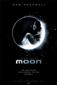Though%20the%20final%20poster%20used%20in%20the%20campaign%20is%20very%20similar%20to%20one%20of%20these%20not-so-lucky%20ones,%20except%20for%20a%20classic%20monotone%20background%20rather%20than%20this%20golden%20tint,%20the%20others%20are%20definitely%20different.%20One%E2%80%99s%20a%20foetal-position%20Sam%20within%20a%20chalky,%20exploding%20moon,%20then%20there's%20the%20misty%20eyeball-style%20affair,%20the%20other%20a%20twist%20on%20the%20same%20image,%20showing%20a%20thoughtful%20Sam%20staring%20into%20the%20middle%20distance%20from%20inside%20his%20space%20suit.%20The%20fact%20that%20there%20were%20such%20strong%20also-rans%20is%20testament%20to%20designers%20[All%20City%E2%80%99s](http://www.impawards.com/designers/allcity.html%20)%20work%20%E2%80%93%20recently%20scoring%20other%20one-sheet-shaped%20hits%20with%20[The%20Millennium%20Trilogy](http://www.impawards.com/intl/misc/2009/girl_with_the_dragon_tattoo_ver2.html)%20and%20[Waltz%20With%20Bashir](http://www.impawards.com/intl/misc/2008/waltz_with_bashir_ver2.html?auto=format&w=1440&q=80)
If you look closely, you can see that the figures in the foreground aren’t that clear – like drawings of Dom, Ariadne, Arthur and Eames rather than reduced photographs of them – and perhaps that’s why it was put to the side. That, or the fact that the other Inception posters, the ones that did make the cut, are all excellent: Dom staring skywards, standing in water, as well as the title-in-the-buildings number and the M.C. Escher's ''Relativity''-inspired building walking one-shot.
The unused poster here is a striking concept piece that grabs the eye (and kind of tells you a bit about the film) but doesn’t quite deliver the goods. Or so some film exec must have thought, giving it the thumbs down despite its obvious excellentyness (our word). In the end, they went for Hayden Christensen in a pseudo-Matrix 27 Dresses kind of affair, and a Stargate-style standing-on-a-Sphinx piece. Sure, the movie has its critics, but the posters ain’t so bad, no?
No article on unpublished movie posters would be complete without a decent number of Drew Struzan concept pieces – so professionally polished they could easily have been the main posters if his others weren’t, you know, even better. Here’s a perfect example from the original Back To The Future, hitting all the key beats: a broken clock, Doc Brown, The DeLorean, Biff in his car, and Marty doing his Johnny Be Good thing. That said, compared to the real deal… well, could anything beat that?
Of course, this is an earlier draft of the perfected original, but it’s interesting to see the notes that Drew must have taken after creating this black and white version. Indy is now looking down the barrel of his gun; a couple of horses are chasing him; Dr. Elsa Schneider no longer sports her hat, and, perhaps most importantly of all, Marcus Brody, Sallah and Professor Henry Jones himself are all blessed with some sort of neckwear. Prof. Jones without his bowtie? It would be nothing short of a disgrace. Kind of. Maybe.
You’re probably expecting us to remain unbiased in our analysis of both posters – the decent Face/Off style photo-based piece, and the unbelievably brilliant Drew Struzan one-piece, a poster so amazingly good we’d happily buy a 6” action figure of it if we could – despite the actual movie being a bag of old wet pants. So… yep. In this case, being unbiased? Not so much. Sorry about that.
The cult classic dark kung-fu comedy caper had a very different form in this earlier draft. There’s no cocksure pose from Kurt Russell, though the gun in one hand and cut-off wire dangling from the other remains, and not enough Kim Cattrall for some studio execs’ liking. There’s also a bit more James Hong (always a good thing) in the bottom left-hand corner, though no subtly semi-submerged swimming in the foreground. Still, Drew Struzan: it’s like he’s physically unable to make a bad poster.
A Drew Struzan-a-like, sure, but a damn good one. Notice all the gorgeous little bits of detail, from the star of David necklace, the smudged, brown stains around the edges, the blood on the right leg, the tiny jets of flames darting out of the explosions… There’s a lot of love in this poster, and it really shows. That said, a bloody baseball bat holding a Nazi helmet and Brad Pitt standing on a pile of corpses… that’s some tough competition.
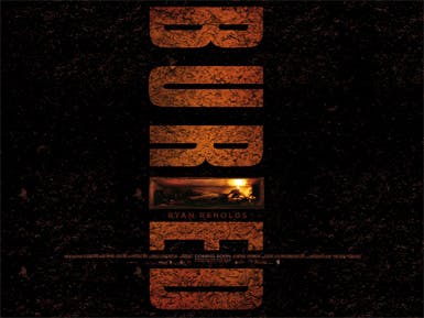There%20are%20just%20so%20many%20different%20also-rans%20for%20this%20movie%E2%80%99s%20poster%20campaign,%20it%E2%80%99s%20almost%20impossible%20to%20pick%20one%20that%20stands%20out,%20so%20we%E2%80%99re%20going%20to%20highlight%20the%20black%20and%20white%20one.%20You%20know,%20because%20it%E2%80%99s%20black%20and%20white%20%E2%80%93%20which%20makes%20it%20arty%20and%20stuff.%20It%20also%20makes%20Ryan%20Renolds%20look%20like%20he%E2%80%99s%20trapped%20in%20a%20block%20of%20ice,%20but%20it%E2%80%99s%20the%20look%20on%20his%20face%20that%20makes%20it%20work%20so%20well%20%E2%80%93%20staring%20into%20the%20beyond,%20thinking,%20hoping%E2%80%A6%20praying,%20probably.%20But%20with%20the%20[sheer%20creative%20black%20space%20of%20the%20final%20poster](http://www.impawards.com/2010/buried_ver4.html?auto=format&w=1440&q=80)